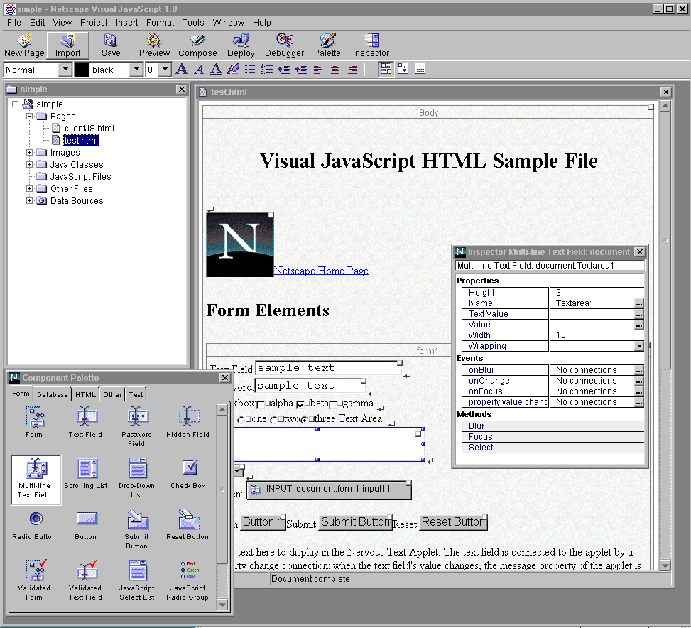
In Visual JavaScript, a project keeps track of the pages and other source files that make up your application. The Project window shows you the contents of your current project and lets you open, add, or remove pages. (See "Project Window.")
When you open a page to work on, it is displayed in a Page Editor window, where you can add components and create the layout of the visual elements that your end user will work with. (See "Page Editor.") You add components by dragging them onto the page from the Component Palette. (See "Component Palette.")
When you have chosen components, you must customize their appearance and behavior, and connect them together to form your specific application. You do this by setting their properties in the Inspector, and making connections in the Connection Builder. (See "Inspector," and "Connection Builder.") You can then test the behavior either by previewing individual pages of the application on the client side, or deploying it on the server and using the JavaScript Debugger to identify problems. (See "JavaScript Debugger.")
As you use these windows to develop your crossware application, you will also encounter a number of other special builders and editors that help you with programming tasks. These tools can even eliminate tasks by generating parts of your application entirely automatically. (See "Additional Tools.")
Main Application Window
The main application window appears when you start Visual JavaScript. It contains a menu and toolbar that give you access to all of the commands and tools that you use to build applications.
A number of working windows appear within the main window as you create and inspect the parts of your application. You can be size and place these windows however you choose. Figure 2.1 shows a convenient layout.
Figure 2.1 The Visual JavaScript main application window

You can create, load, save, and work with projects using the commands on the Project menu. Right-click an item in the Project window to display a context menu containing commands that apply to the selected item, or use the commands on the Project and File menus. Each HTML page in your project is listed under Pages in the Project window, where you can double-click it to display it in a Page Editor. As you add components to your pages, the required source files for those components are automatically added to the project and listed in the Project window. Although data sources are not part of an individual project, the Project window also shows you which data sources are available on the deployment server and allows you to identify new ones. (See "Identifying Data Sources" for more information.) You can click the "+" icon to open a data source and see the tables and columns defined in it.
You can use the Project window to import specific files into your project. You can import existing HTML pages into the project in order to re-use them, modify them, or incorporate elements of them into your application. You can also import image files, so that they are available locally and delivered with the application. (See "Adding Pages and Files to a Project" for more information.)
When you move the cursor over a file in the Project window, a tool tip appears, showing the full file name. For image files, the tool tip shows a thumbnail version of the image.
Page Editor
The Page Editor is where you create, add to, and modify the page contents of your application. When you double-click an HTML page file in the Project window, a visual representation of the page appears in a Page Editor window. Each page appears in its own Page Editor window. As you build a page visually, Visual JavaScript creates and maintains the HTML code for the page.
The Layout view that first appears shows your components visually. For visual components, this view shows approximately how the finished page will look to the end user. This is the view in which you do most of the work of building the page. However, you can display the page using any of three views: Layout, Structure, or Source. To see and work with a structured view of the HTML code that is generated as you build the page visually, select the Structure view. To see the actual HTML source code, choose the Source view.
Select a view in any of the following ways:
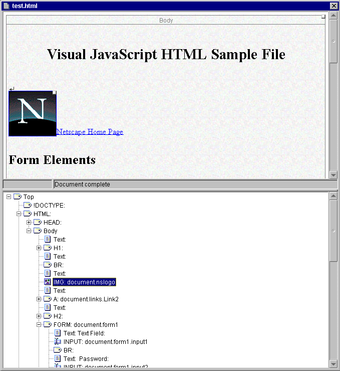
Tip Split the Page Editor window, as shown in Figure 2.3, to display more than one view at a time by choosing Split from the Window menu. A new pane appears at the bottom of the window, displaying the same page using the view you choose. To remove a pane, click the bar between the panes and drag the cursor all the way to the top or bottom of the window. §
Figure 2.3 Layout and Structure views of the same page in different Page Editor panes
Structure View
The Structure view displays a hierarchical organization of the HTML code for the page. Use this view to work more directly with the generated HTML. A component generally corresponds to more than a single HTML tag. In the Structure view, you can select and inspect not only the component, but also the tags within a component. You can drag and drop HTML tags within the page's Structure view, or to the Palette, from which you can drag them to other pages.
When you select a page element in the Layout view, the corresponding HTML tag is selected in the Structure view. When you select an HTML tag in the Structure view, the corresponding page element is selected in the Layout view. The cursor is inserted in text to indicate selection. Selected objects in the Structure view also appear in the Inspector, where you can examine and change their properties.
Source View
The Source view displays the HTML source code for the page. To make the HTML code more readable, click Reformat Source in the upper-right corner of the window to automatically insert lines breaks as appropriate.
NOTE: Direct editing is not supported in the Source view for this release; however, you can choose any other editor to edit the HTML source directly. See "Using an HTML Editor to Edit Pages" for more information. §
Figure 2.4 Default Form components on the Component Palette.
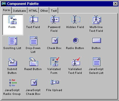
HTML. Components such as Table, Image, and Link, that are made of standard HTML tags or blocks. (See "HTML Tab.")
Database. JavaScript and Java components that let you connect to specified databases and make use of the LiveWire database functionality. (See "Database Tab.") These include:
Test. Sample components intended for testing or learning about database access pages. These include the Java Dummy Cursor, the JavaScript Dummy Cursor, and the Java Form. (See "Test Tab.")
Each of the built-in components is described in detail with a list and description of all properties, methods, and events in Part 2, "Component Library Reference."
You can customize and extend the Component Palette in a number of ways:
Inspector
Components have properties that control their appearance and behavior. System objects, such as projects and pages, also have properties. Use the Inspector to examine and change properties. You can display the Inspector in any of the following ways:
Figure 2.5 Inspection of a selected Form component
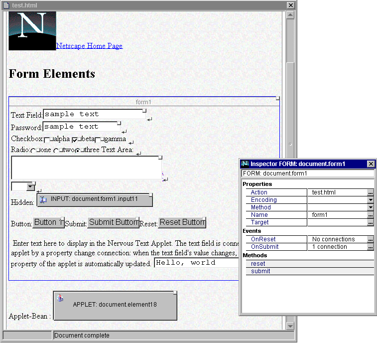
=), or a downward-pointing arrow. These buttons bring up a custom property editors suitable to the property.
NOTE: If you have created a component of your own that includes its own custom editor (called a Bean Customizer), the Inspector will automatically make it available when you inspect the component. §
Connection Builder
The Connection Builder allows you to add behavior to your client-side components by connecting a user event (such as a mouse click) in one component to a method or property in another component. When the user of your application takes an action (such as clicking a button), the connection you have built can cause another client-side component to change. For example, a click can cause a table to be updated with new data.
There are three ways to bring up the Connection Builder:
Figure 2.6 The Connection Builder
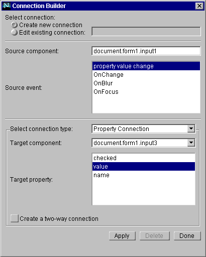
NOTE: The Connection Builder always shows the currently selected object as the source component, as long as it is a connectable object. If you click another connectable component in the Page Editor, that becomes the current selection, and the new source component. If you are in the middle of building a connection, a message appears to warn you that the current connection information will be discarded. §The bottom section of the Connection builder shows the target of the connection.
NOTE: The Connection Builder makes only client-side connections. To make connections to or between server-side components, you can set properties to refer to other components or property values. For more information, see Chapter 5, "Adding Behavior to an Application." §
Additional Tools
In addition to the main windows described here, there are a number of tools that help you perform programming tasks automatically. These are variously accessible from the Connection Builder, the Inspector, and directly from the menus.
Database Application Wizard
The Database Application Wizard is a tool that automatically generates pages to perform the data access task you specify. The tool creates and connects all of the needed components and pages to perform the following kinds of tasks:
Custom Editors
Custom property editors help you build code expressions by generating correct syntax as you choose from lists of possible values, thus eliminating many typing errors that can waste debugging time. Other editors help you create or customize components.
SQL Query property in the Inspector. See "Creating SQL Queries."
DBPool property in the Inspector. See "Connecting to the Database."
Last Updated: 11/06/97 13:24:48